

A recent survey shows that most of us view at least 25 slide presentations per year. This is most certainly true for physical therapists, whether it is an in-service at the clinic or sessions at annual conferences.
Of the dozens of presentations, how many are memorable? What makes a presentation memorable? Aside from a story that resonates with your audience, engaging slide design is they key to sharing your message.
In this post I will illustrate what I mean by “engaging slide design” using a recent experience in which I was entrusted with a slide deck from a colleague who asked me to “jazz it up a little”. You see, I let this colleague in on my little secret – I am a presentation snob! Let’s get started…
Title Slide
Before

I did not like all of the logos on this slide. The “four corners” look really takes your eye away from the purpose of having this slide: to convey the TITLE of your talk and your name. Also presents too many font types and gives an eclectic feel to the slide. If you have a good introduction, which is not always the case, your audience will know where you’re from and who you represent. Presumably they also know that they are sitting in a chair at AAOMPT. I would also argue that only Johnny needs to be listed on the slide and to remove “Presenter:”. Mintken and Struessel can be moved to an acknowledgement slide. A black slide background is not a good choice, especially if your audience is going to attempt printing them out later.
After

One logo, one presenter name, no background color. Credentials are impressive but can take up more characters than your name and so I prefer to leave them off. I also convinced Dr. Mintken to finally join Twitter. You can learn more about Twitter use in physical therapy from this recorded lecture. Basically, by providing his Twitter user name “@PMintkenDPT” he is giving his audience a way to share content from his talk with others not in the room and providing a venue for discussions about his work long after the talk is over. It is 2011 and didn’t you know Twitter is the new Facebook?
Background Slides
Before

Time to build up your story by explaining why things are the way they are today, a.k.a. the background slide. This slide is typical of all slides in the “Before” deck, a title with bullet points, not one single image, redundant logos in the top corners, and a stock theme from PowerPoint.
After

In the first 60 seconds of your talk your audience is sizing you up and determining if they want to pay attention, you better grab them early! I suggest a full bleed, high-quality photo of a joint manipulation. The audience knows what they’re in for and they also have a better emotional response to a photo then a bunch of text. I confess that I did use bullet points here, but this is one of the only slides I used them. I felt that it was appropriate here because I am listing several items in the same class, terms for spinal manipulation.
Before

After #1

I really wanted an image to demonstrate how much research on the effectiveness of joint manipulation is out there – a stack of papers.
After #2

I used a photo of a classroom for the question – Are students receiving the education?
Before

Every talk with a research component needs to discuss what has been published previously. Here we see what is typical, a bulleted summary of the results.
After #1

It is also very common to put a screenshot of the title and author on your slide. I’ve been playing with a different way of showing the reference to the audience by capturing a screenshot of the top and sides of the paper and putting it into the slide with a shadow dropped behind it. The effect is that there is a physical paper out in front of you. Then I took a page from Garr Reynolds and built in the “56 %” in huge characters on top of the image of the article.
After #2

I also transformed the bulleted list of reasons why joint manipulation was not taught into a table.
Before

Here is another example of a slide that is covering the results of a previous study.
After

What I did here was magnify the bottom line of the study – 54% of clinical instructors reported not teaching joint manipulation. Again in a huge font, with an image of a PT clinic that reflects the fact that this lack of instruction on joint manipulation is happening in the clinic (where everyone in the audience also works).
Before

The presenter wanted to draw attention to the fact that some time had passed between when these studies above were published and when this talk was given. And did so with a text box.
After

I wanted to again use imagery to get a gut reaction for the audience. What happened in 2005 that really shows a large amount of time has passed? A pop culture image would surely connect with the audience. This is were Napoleon Dynamite can in to save the day. The presenter wanted to demonstrate that 5/6 years is a long time and I would argue that it feels like ages since since classic lines such as, “I told you! I spent the summer with my uncle in Alaska hunting wolverines!”
Methods
Before

People want to know how you did the research your presenting – the Methods. Here I saw another opportunity to transform bullet points into graphics.
After

The large blue circle represents the Program Directors and the small ones are the students that received the survey distributed from the Directors.
Results
Before

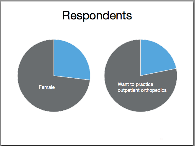
The data could be conveyed more effectively by using graphics over bullet points. But how?
After #1

Because the data were based on geography, a map immediately came to mind. You tell your audience that 38 states participated in your survey and they are probably wondering “was my state one of them?” I downloaded a vector graphic of the USA from wikipedia and filled in the relavanet states in Adobe Illustrator.
After #2

What about percentages? A pie chart works well to quickly show proportions. Put yourself in your audience’s place: while you are talking do you really want your audience to need to read all of your bullets? The words coming out of your mouth are in direct competition with the text on your slide. Make it easier for your audience to digest!
Before

For the first bullet point, a sub bullet point is used to convey MUCH IMPROVEMENT.
After

Made the 95% larger, in green to suggest this is a good thing, and put a thumbs up graphic in place of CAPITALIZED TEXT
Before

Here was an opportunity to tell the audience WHY students were not performing the joint manipulations they were trained to do.
After

Great opportunity to add some video into the talk. It is one thing for Dr. Mintken to stand up front and read quotes from students. It is a much better thing for him to show video testimonials from the actual students themselves.
To conclude…
So, all of these changes were made to this slide deck. How did it go? The presenter (Dr. Mintken) was pleased with his delivery of the talk, which is a good thing. For the remainder of the four day conference, every time someone approached Dr. Mintken the first words our of their mouth were “that was a really great talk!”
Here are some great books that have influenced my approach to slide design – Presentation Zen by Garr Reynolds – slideology by Nancy Duarte
I would love to hear your thoughts on how the slides changed in the comments section below.
– Mike
I certainly enjoyed the way you presented the information, it was much more interesting and made an impression. It has challenged me to upgrade the presentations I am working on and to take a look at your references. Thank you.
Enjoyed the before and afters. I’ve seen many that look like the befores…. same format different topic. I think the themes and framework of a program (ppt) limits the creativity in trying to reach the audience. I like seeing presentations that do a little of entertainment and your changes were engaging. No yawns.
I’m surprised that only 54% of instructors teach joint manipulation.
The challenge I have is getting my female clinicians to try to manipulate the larger male patients.
I tell them to try on the big boys – you may not get a cavitation but the smaller sized people become much easier after you’ve struggled a bit with the big ones.
By the way, I am tall (6’1″) but only 175#. My patients are mainly from the United States where the average height is 5’9″ and 190#.
How would you suggest improving my success in training my female therapists to manipulate their male patients?
Thank you,
Tim Richardson, PT
Great use of before and afters! I am teaching spinal manipulation to some entry level DPT students a few members of the Buffalo, NY PT community and have many of the same slides. Only mine fall into the “before” category!
Hi Mike – This is a great post! I love the before and after slides. I conduct workshops for business managers on how to use PowerPoint more effectively and they also find the before/after slides a great educational approach.
This makes it so easy for someone to recognize what they’re doing wrong and – most importantly – how to fix it. You’ve done a great service for your readers, and for their audiences as well.
I like your creative use of imagery to capture and shorten the text meanings you mean to convey throughout this presentation. Also, the additional use of testimony footage versus a statement of testimony really sells the point better. The only reason I would challenge some of the slide design at all would be if you were designing slides to also be used as handouts like professors often do during lectures. Sometimes overlying images will cut out the usable information on a slide, making it a useless reference when the clinician returns from a talk like this. So a nice way to side step that is just create a completely separate handout that bullet points the “take home message” and perhaps lists your references for easy access. Nicely done, thanks for the ideas!
I see your point Sarah. This is an area I struggle with, the handout. I could simply say “create a separate handout to supplement your slides”. But this will take more work and time and is not appealing.
I will start lecturing in anatomy soon and am having a hard time imagining slides with lots of text and bullet points – gag me! So what should I do? Students will have my slides to take notes ahead of time, either electronically or on paper.
I don’t think I will compromise on my style of presenting, but a real life test will happen next year and I might succumb to the pressure. Probably not.